For a fun Friday guest post, Marcela De Vivo is joining us today. Marcela is a freelance writer from Los Angeles, focusing on Marketing, Real Estate, and Technology. She works for Process Sensors Intl and spends her time connecting online, reading and researching.
—————
The 21st century is one of the most innovative eras for architecture. With great ideas, there comes great failures.
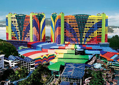
Starting at number ten is the First World Hotel from Malaysia. It was once, the biggest hotel in the world, but it fell short in terms of design. The main problem came with the color scheme. It looks as if the designer had an obsession with rainbows.
—————
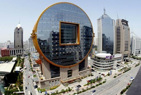
Number nine goes to a building that looks great as something in your pocket, but not as an architectural inspiration. It resembles an old Chinese currency that is circular with a square cutout in the middle. The building, known as the Fang Yuan building, is in Shenyang, China.
—————
Eight is the Federation Square in Melbourne, Australia. It contains many buildings that seems incomplete. Patched by a bunch of metal plates with various patterns, the square is lacking a wholesome building.
—————
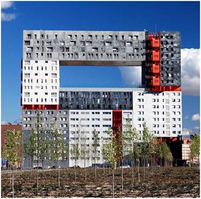
Lucky number seven was created through the collaboration of Dutch architecture studio MVRDV and Spanish architect Blanca Lleo. The result was not so great. Assuming they were going for a abstract look, it came off as random and bland. It contains random streaks of red lines in obscure areas.
—————
Six is a shiny pineapple shaped building in Macau. It is a hotel and a casino with 430 rooms and over 800 table games. It is also the home to the “star of Stanley Ho”, the world’s largest cushion shaped internally flawless D-color diamond.
—————
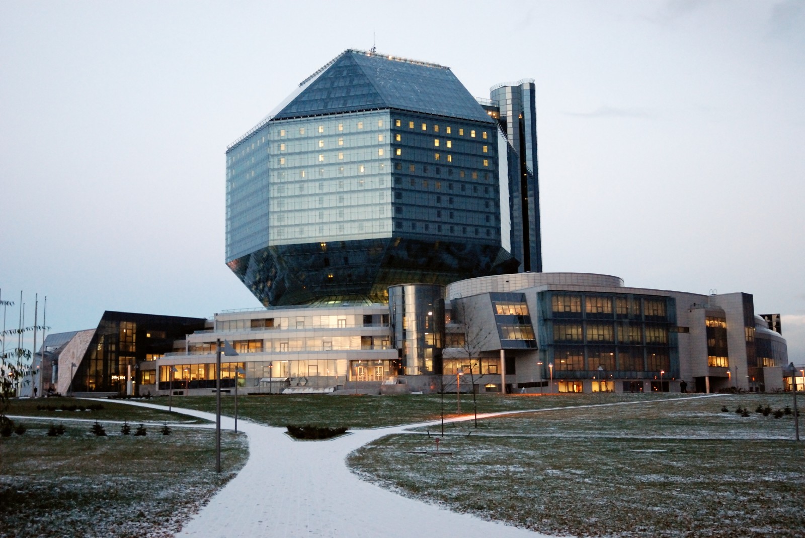
At number five, the National Library of Belarus opened in 2006 in Minsk. The shape is reminded of a virus. It houses the largest collection of Belarusian printed materials and has the third largest collection of Russian books.
—————
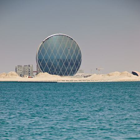
Number four is similar to the Fang Yuan building because of its circular structure. The Aldar headquarters located in Dubai has the shape and color of a fly’s eye.
—————
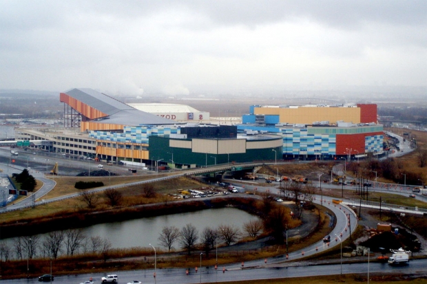
Number three is the Meadowlands Xanadu that is to be finished by 2013. It is located in New Jersey. Even the governor is saying bad things about the project.
—————
Number two goes to the EMP Museum for being just plain random and hideous.
—————
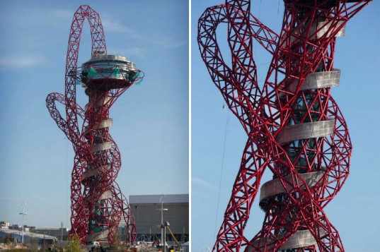
Number one, the worst architecture made to this date, is none other than the latest observation tower of the 2012 London Olympics, the ArcelorMittal Orbit sculpture and observation tower. It is like an entanglement of wires construed together by an even gray spiral.
—————
This concludes my list of the top ten architecture mistakes of the 21st century. You really have to wonder what the architects were thinking when they created these buildings. All we can do is hope others won’t follow suit.
Do you concur? Object? Have other nominations? Let us know in the comment section, below.
Just came into this post because I’m following architecture in China. Architecture is subjective, no doubt. Modern architecture has the advantage of modern engineering too. The problem is when people think something is different is just wrong. In actuality a building that is unique or something different is a talking point, can be an icon and is identifiable when in a crowded city. This alone transcends it above a typical and yet banal building. There are other factors than looks of course. Is the building functional, does it serve its purpose? Colour alone doesn’t satisfy the criteria, which is why number 10 absolutely deserves to be on such a list as this. However number 2, 4, 6, 8, and 9 are all examples of good architecture, in my humble opinion. Federation Square has won a number of awards and is a popular place for locals and tourists.
Cameron: Thanks for your comments. It is true, architecture is very subjective, and I would probably have a different top 10 list if I were writing the post myself.
The statements made about these buildings carry no value, perhaps only the rainbow hotel I’ll agree with. The projects are perfect each in its own way and if you”re not an architect you should not lift opinions about proffesionals work. And if you are an architect, maby your jealous and tired of designing square boring homes….
Thanks for sharing your view point, jg, though I’m not sure what you mean by “lift”ing an opinion. This was a guest post.
If the statements made by Marcela carry no value, then neither do yours, jg. Architecture is meant to affect people as it shapes the spaces we inhabit. So, the way a building makes you feel is very important. We are all equal in this respect. Nothing makes your opinion more valuable than another’s. Most of the buildings and structures on this list are modernist and deconstructivist (opposed to traditional or classical) which often makes people uncomfortable because they break all the basic rules of architecture: firmness, commodity and delight. These structures are (arguably) works of art or sculpture and don’t really serve a useful purpose in function or delight. They may be structurally sound, but they defy the laws of nature and gravity and therefore intuitively make most people feel uneasy. I enjoyed this post and think the commentary was fairly reasonable and reflective of society.
JR:
Thanks for your comments. When aesthetics are involved, everyone has their own opinion of what is “good”, “bad”, “ugly”, or “sublime”. I myself am more into traditional architecture, but do enjoy some (limited) modern buildings too. Beauty, eye, beholder and all!